Have you heard of the term, Stylescape?
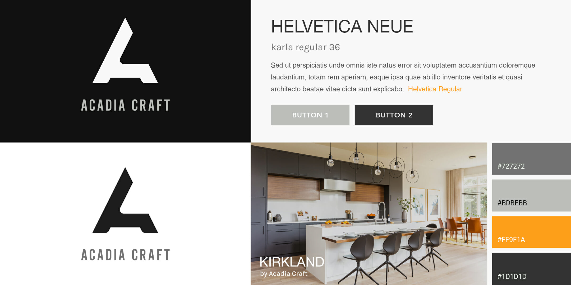
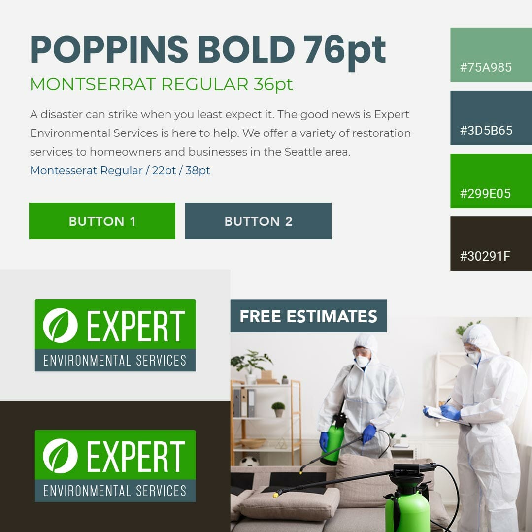
For a digital agency, a stylescape is a tool for presenting brand aesthetic and overall design options to the client. It includes all the elements that work together to create the look and feel of a specific company. Stylescapes include colors, logos and other graphics, visual design elements, typography, and even the tone of language used in written content and more. They demonstrate all of these features before the design team presents the final markups to the client.
As a stepping stone between the conversation about how the brand wants to betray itself and the mockups, a stylescape minimizes the chance to overwhelm the client completely. They capture attention, convey meaning and focus, and educate them while still allowing time for conversations and feedback about the plan. They are presentation tools for overall brand identity design before you reach any ultimate decisions.
The brand identity design process starts with consultations and conversations that allow the project team to fully know and understand the company they are working for. Then, they use their research skills and creative minds to develop and combine multiple stylescape options for consideration. If they created final markups at this stage, it would not give the client an opportunity to provide natural feedback in the most helpful way possible.
Every project has a unique stylescape approach.
All of them, however, involve a lot of research behind the brand story and goals to craft a cohesive strategy that gets the key message across well. They frequently begin with a logo or any existing necessary details. The creative professionals behind the stylescape seek out inspiration from many sources that align with the most effective aesthetic focus. Sometimes this pertains to one specific keyword or even an individual product or service.
The digital agency and client must work together to finalize the stylescape essence. Frequently, the project team suggests three different options, gets feedback from the client about what elements they like and do not like, and then they rework the stylescape to incorporate the best. Doing all of this before creating mockups saves time and reduces the amount of work needed in case the client does not like one or two details.
Stylescapes are not mood boards. They are the culmination of ideas and inspiration and not a way to convey them to the client in the beginning. They include deliberate design choices made after fully understanding the business in question.
The combination of details shown in a stylescape are chosen to create a brand-specific emotional response. When the business clients respond favorably to this presentation, it gives more information about the ultimate response of their target audience to the final website, advertisements, and other media that will use the colors, typography, and styles in the stylescape itself. After these responses align favorably in conjunction with the brand goals and desired outcomes, the stylescape is used to create mockups specific to the company.
Every brand needs a specific marketing aesthetic that creates a cohesive feeling and response in every consumer who experiences it. All brand assets must go together well to boost brand recognition and reputation. When a skilled digital agency uses stylescapes to create this, the opportunity for the brand to present a unique and memorable experience to members of its target audience increases.
If you have any questions about creating or requesting a Stylescape, send us a message, we are happy to help!


